Hover to visualize internal liver anatomy.
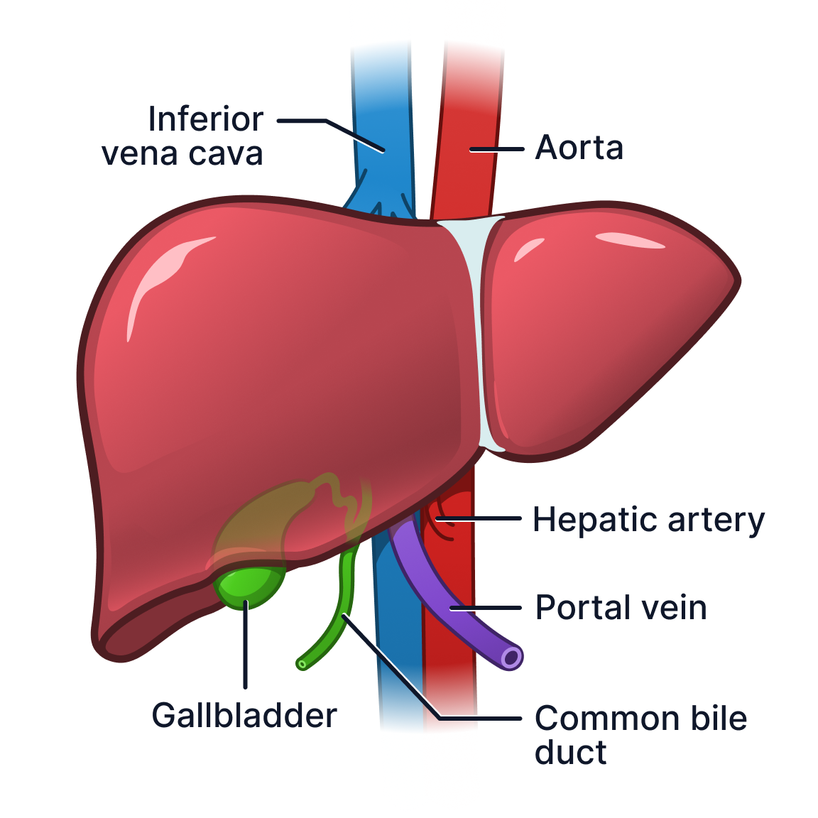
A step up from the stock illustration PocketHealth was using, this visual had the honour of being nicknamed “juicy” by PocketHealth’s founding designer.
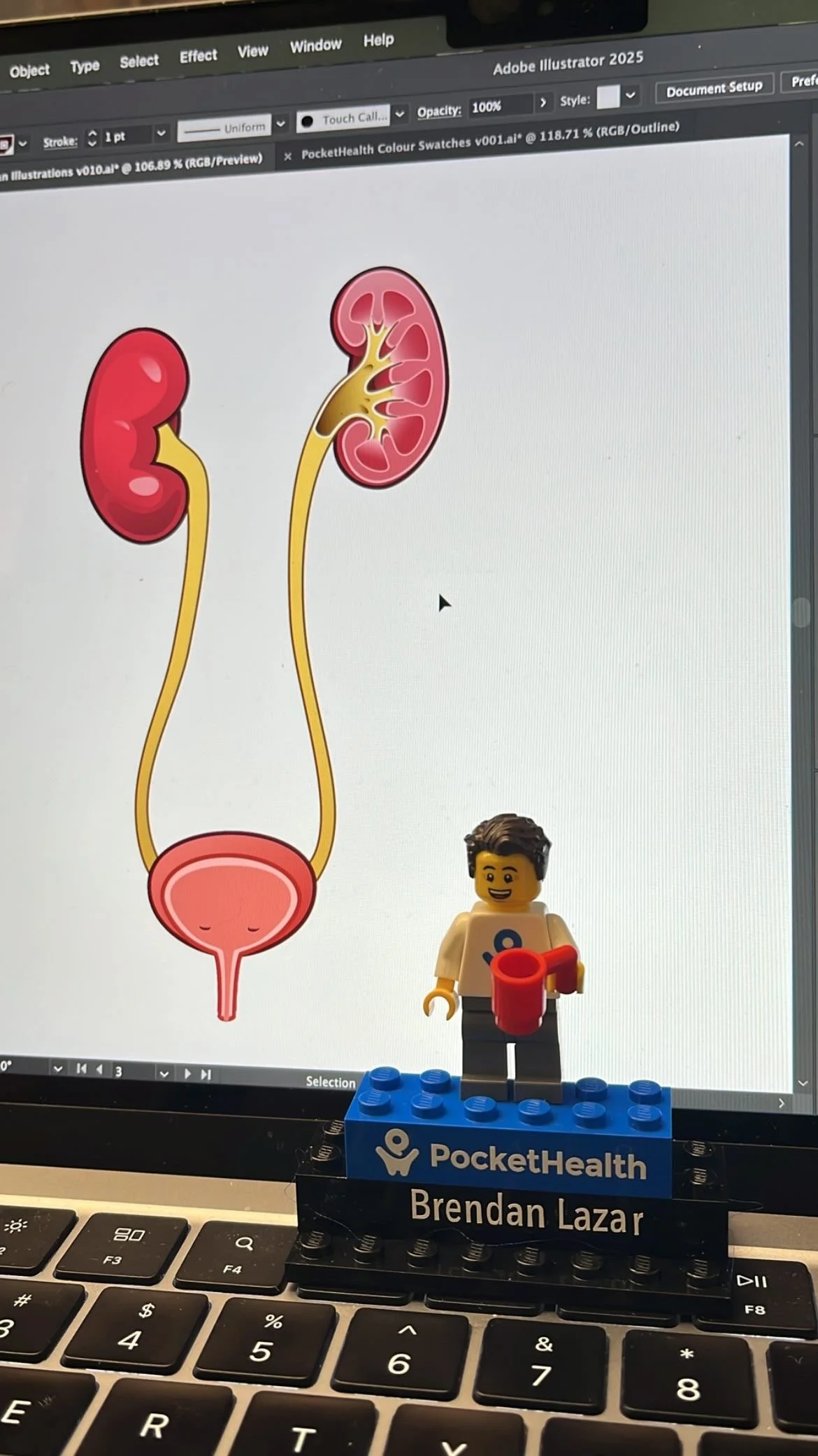
All PocketHealth employees receive a Lego Mini figure version of themselves
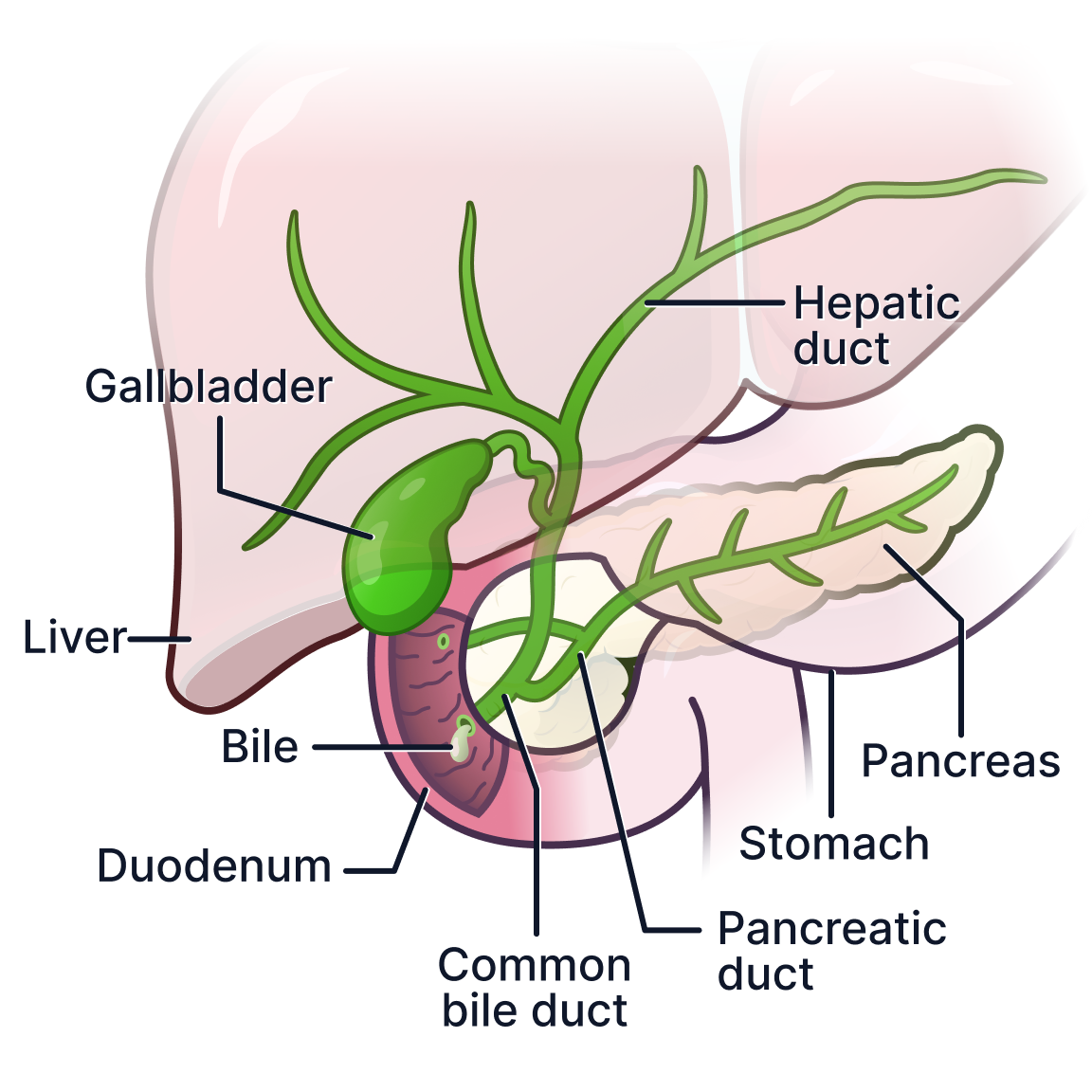
Biliary system illustration previewed in Figma UI framework
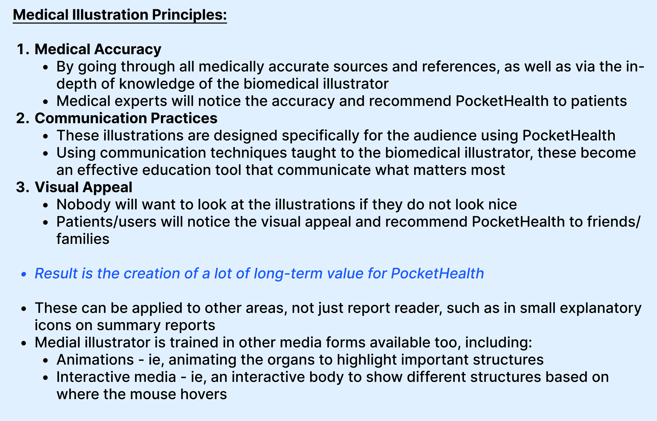
Working as PocketHealth’s First Biomedical Communicator


Following completion of my MSc in Biomedical Communications at the University of Toronto, I joined PocketHealth as the company’s first Biomedical Communicator. My role focused on making radiology information more understandable and accessible for patients through medical illustration, visual systems design, and patient-centered communication.
Working closely with designers, engineers, and leadership, I developed over 300 explanatory medical diagrams and helped shape the communication language of PocketHealth’s medical visualization experience.
View on desktop for best experience
Communication Challenge
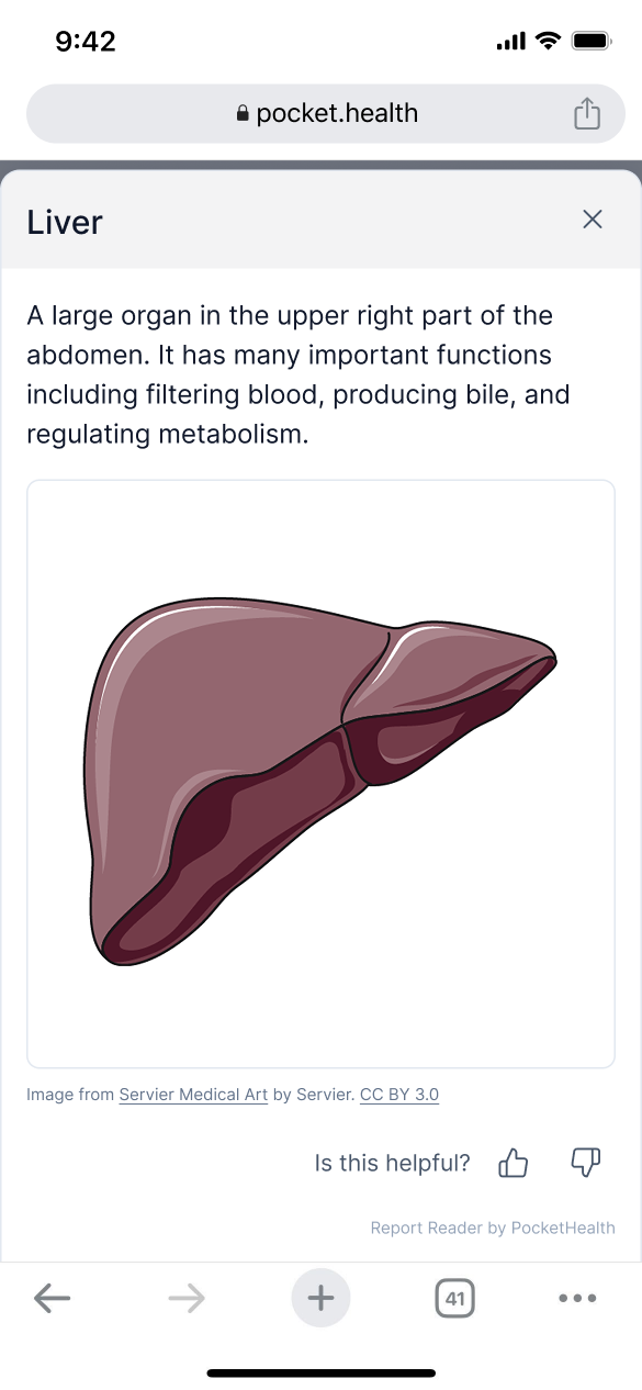
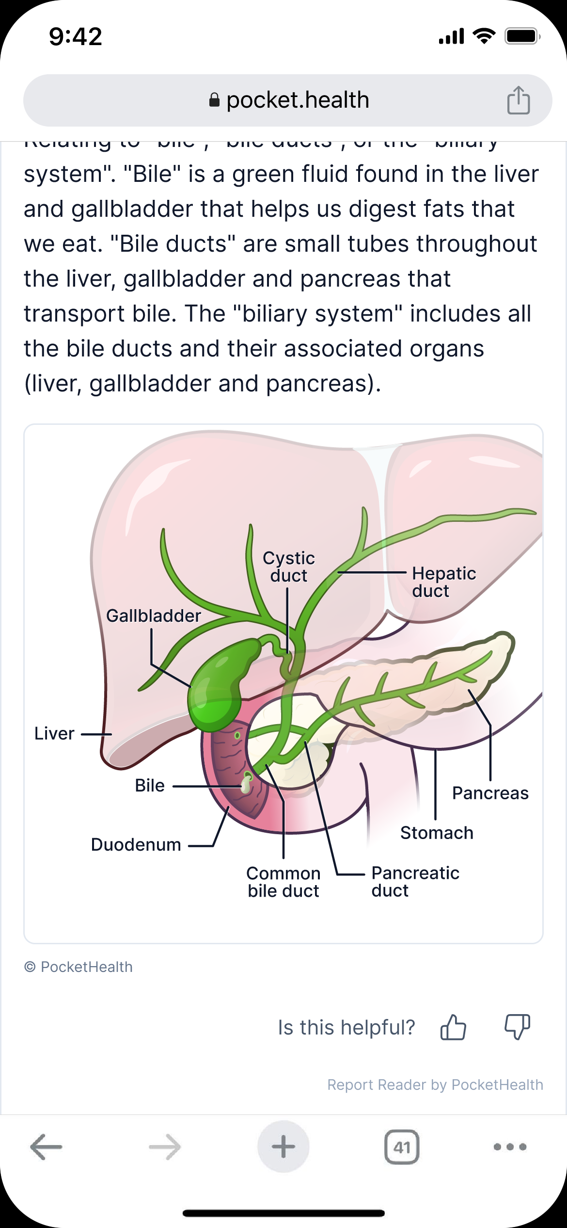
PocketHealth had been using images from Servier Medical Art (a free online stock illustration bank) sometimes without labels. There is very little information conveyed here.
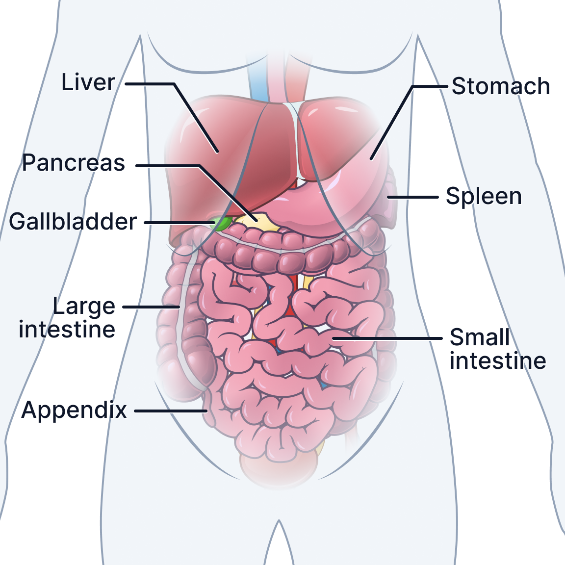
PocketHealth’s Report Reader help’s patients better understand their healthcare reports independently.
Originally, the system relied on only tagged medical terminology connected to written definitions. While useful, terminology alone often lacked the visual context necessary for patients to fully understand anatomical structures, imaging planes, or report findings.
In 2024, PocketHealth expanded the platform with AI-assisted organ visualization features designed to highlight anatomical regions within radiology scans. Even with organs highlighted, radiology scan highlights alone are something most in the general public cannot interpret. The platform required consistent educational visuals that would bridge that gap clearly within a highly constrained digital interface while working seamlessly with the scan and term tagging system.
The project required developing an entire visual communication system that could:
integrate into PocketHealth’s existing product ecosystem
remain understandable for non-medical audiences
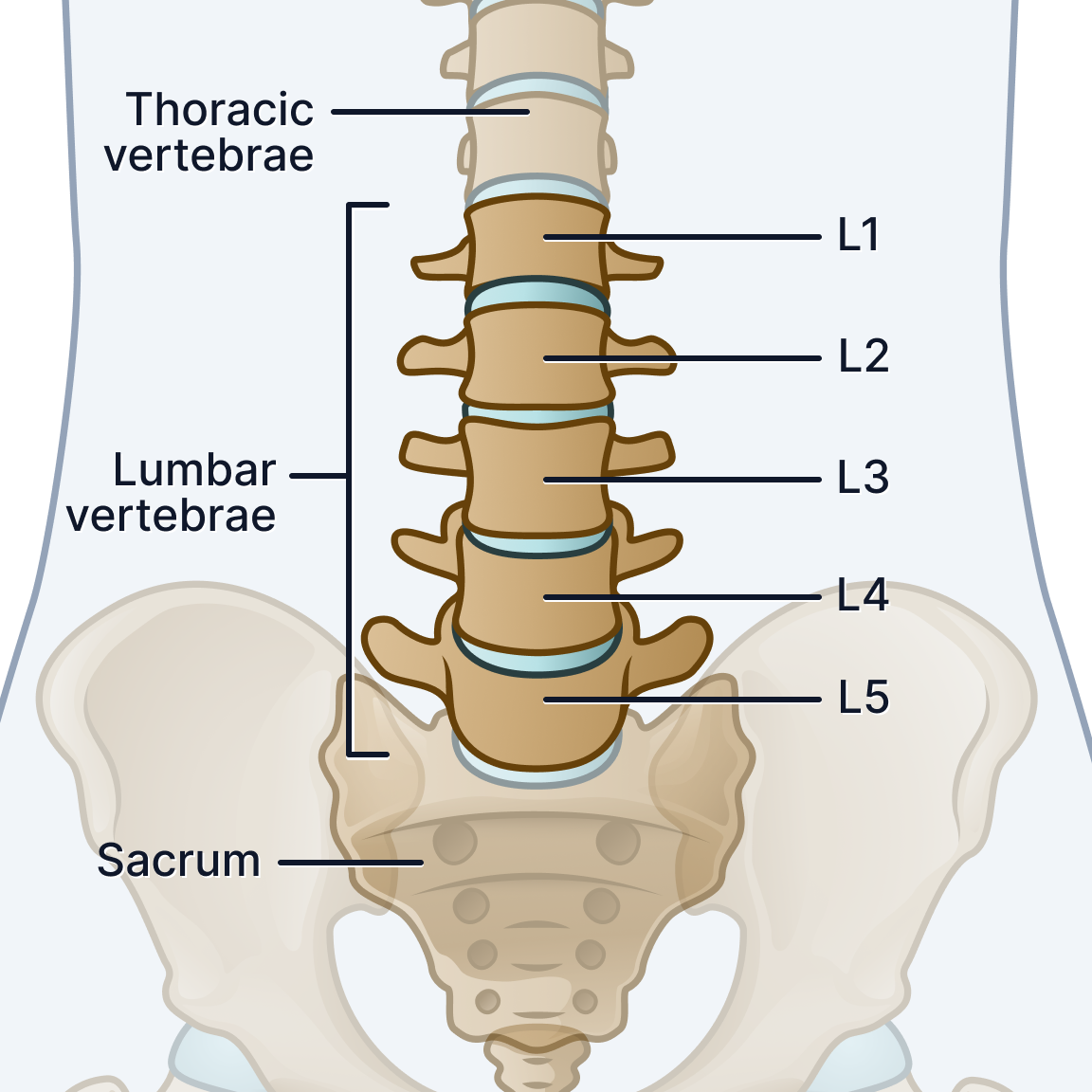
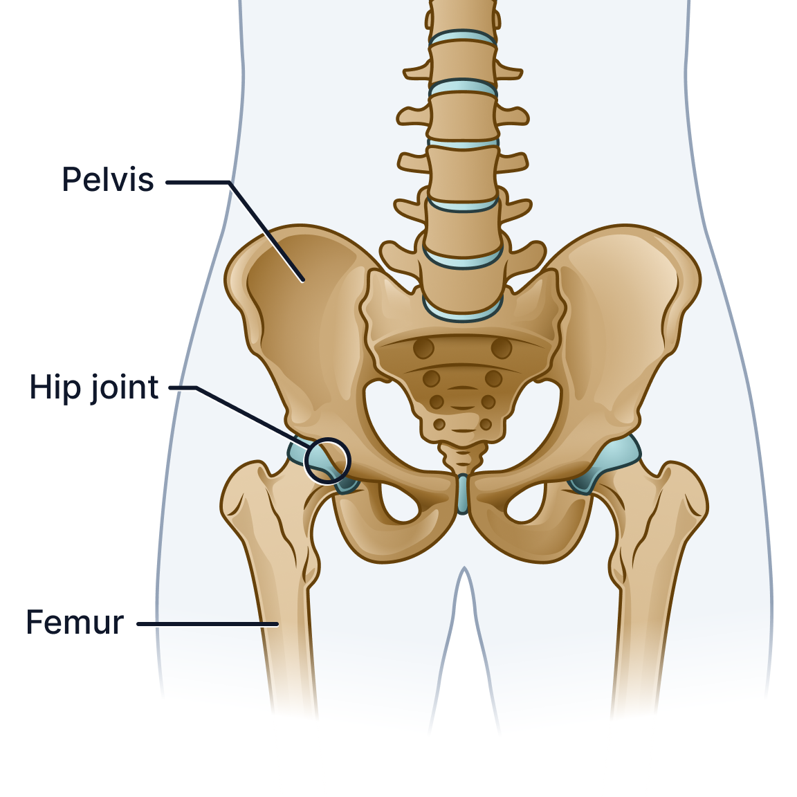
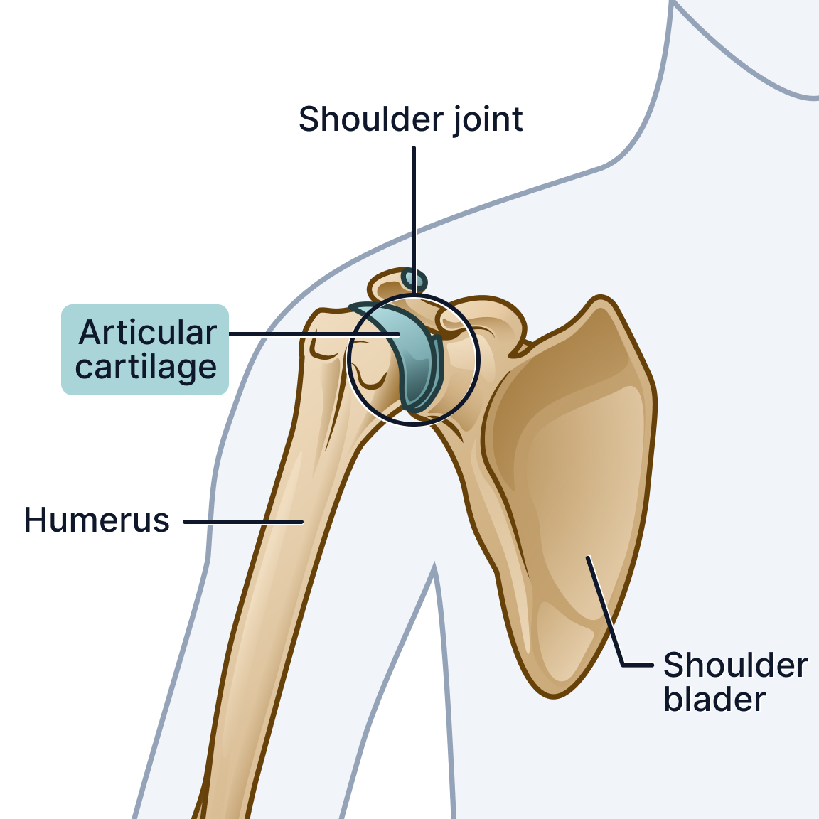
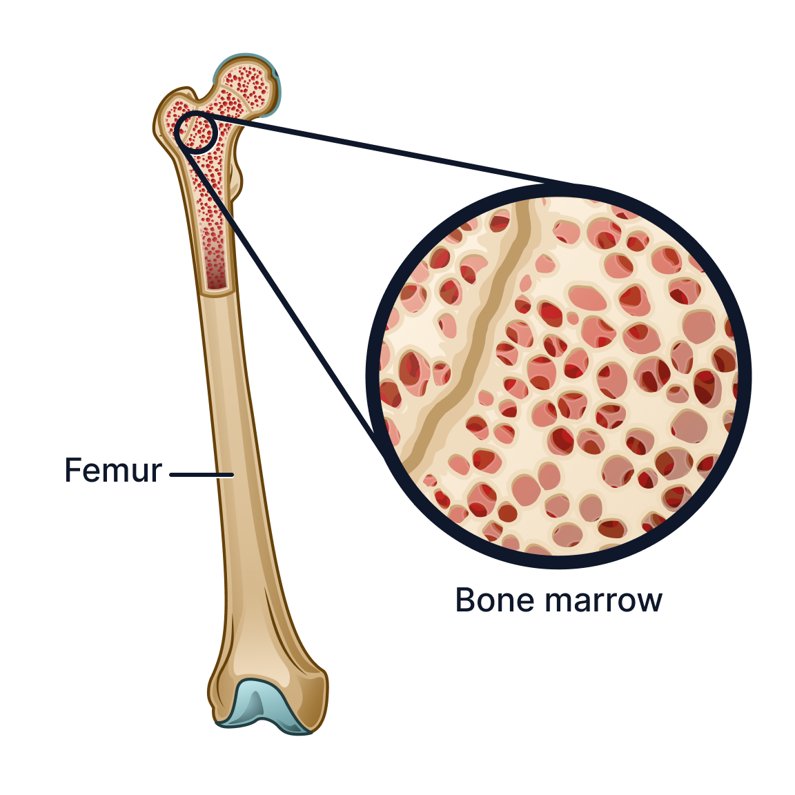
maintain anatomical accuracy
scale efficiently across hundreds of future illustrations
function clearly across mobile and desktop environments
At the start of the project, very little infrastructure existed for how these visuals should be designed, standardized, or implemented.
Constraints
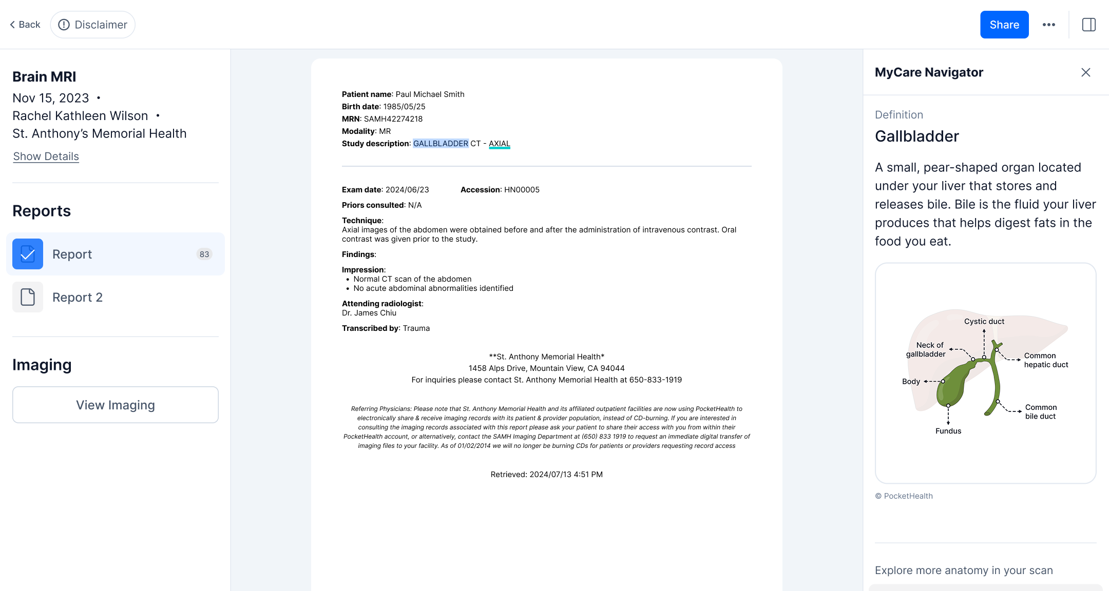
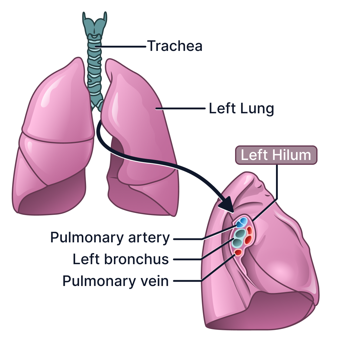
Desktop UI for PocketHealth’s MyCare Navigator in 2023
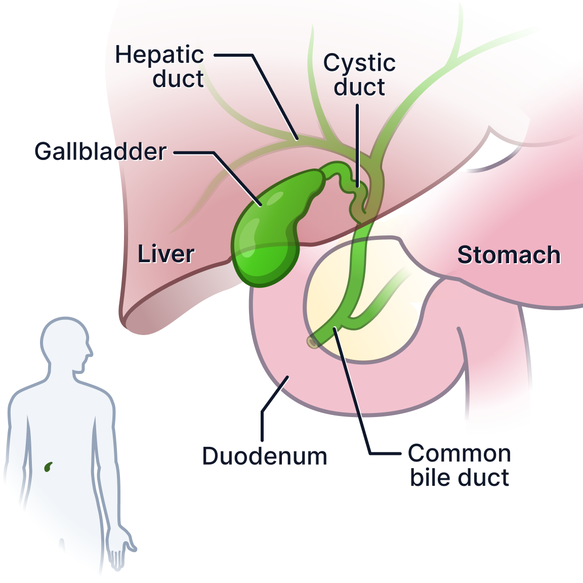
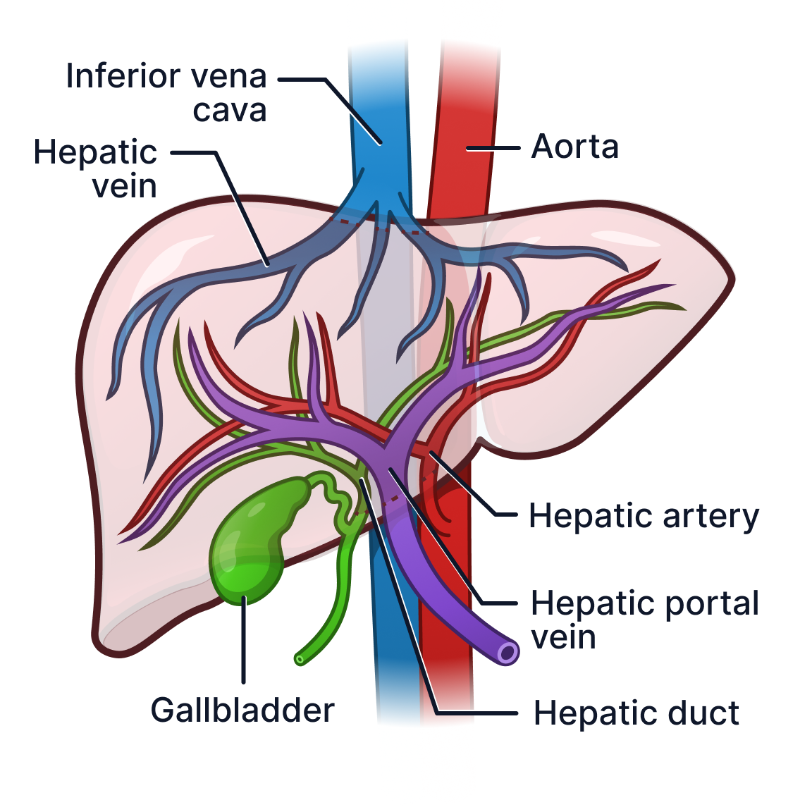
PocketHealth had previously had a junior designer take a stab at medical visuals, resulting in the gallbladder visual to the right of this screen grab. I could see it was difficult to interpret and needed a better and more accessible visual language. For example, it is not clear that the gallbladder sits under the liver which it does in reality since the designer illustrated it to sit on top of a faded liver. Visuals like these can create confusion for patients when visiting and discussing results with doctors.
The illustrations needed to operate within several major constraints:
Small mobile-first viewing areas
Variable levels of patient health literacy
Strict anatomical accuracy requirements
Consistent visual language across hundreds of illustrations
Compatibility with engineering and product workflows
Integration into PocketHealth’s existing UI system
Fast iteration and scalable production
In many cases, the illustrations also needed to communicate anatomy within compact four-by-four inch interface regions while remaining readable on both desktop and mobile devices.
Jotting notes down regarding illustration guidelines for reproducibility was essential, not just so PocketHealth has this information but also so that anyone can reproduce the style of the illustrations as needed to follow the established brand.
Notes on Figma to help colleagues understand proper medical communications systems and the goals of the visuals
Building a Visual System
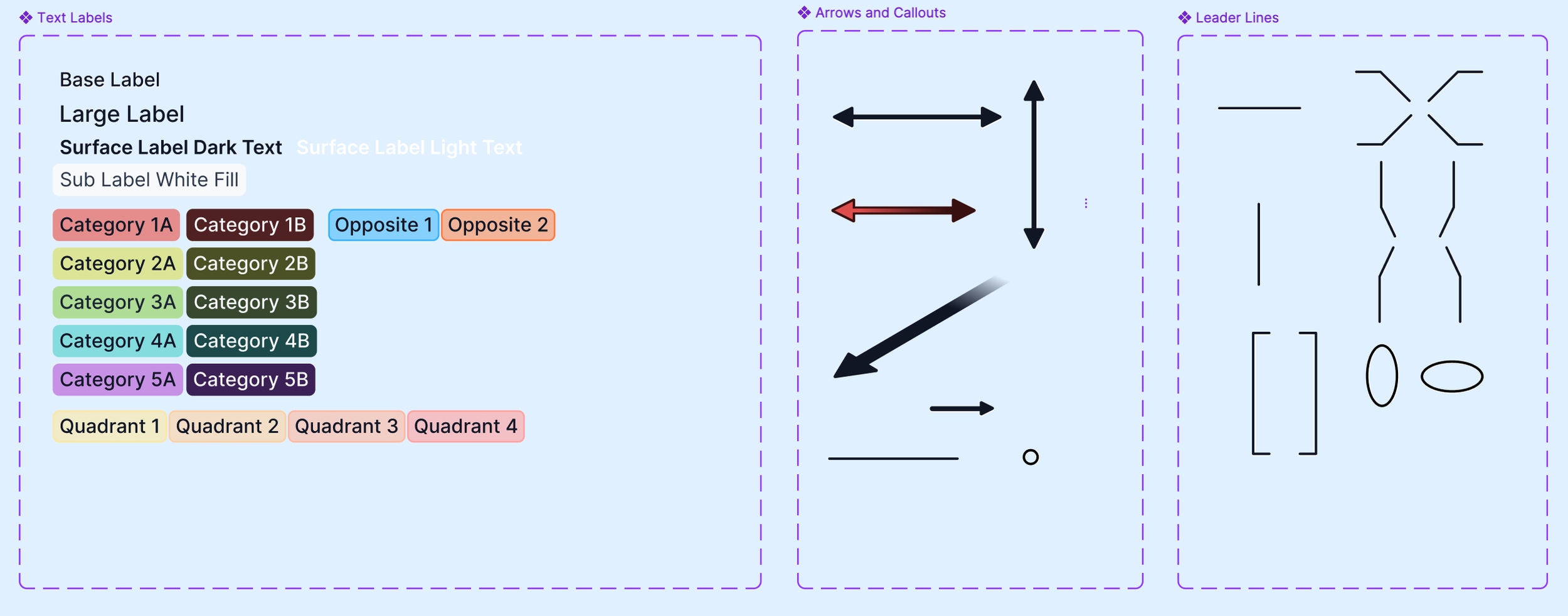
Rather than approaching each illustration independently, I focused on building reusable visual systems that could scale across the platform.
This included developing:
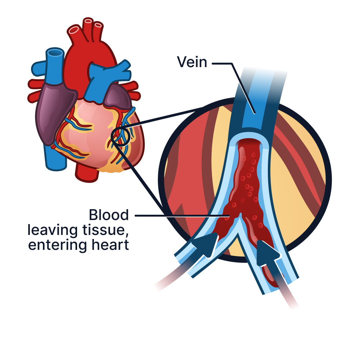
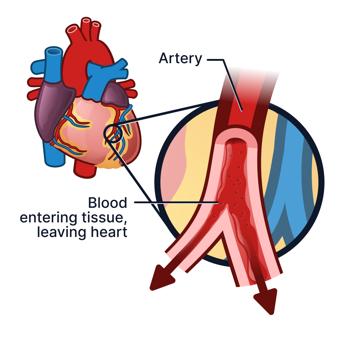
standardized label systems
reusable leader line components
anatomical orientation systems
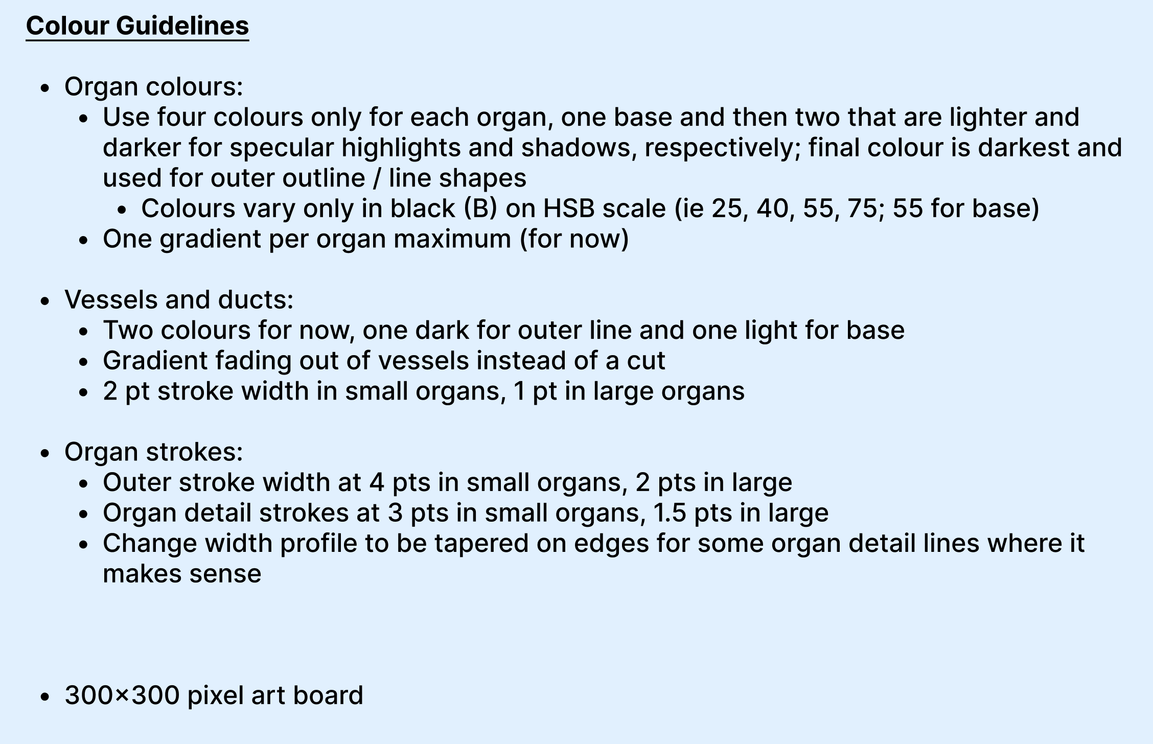
colour and hierarchy guidelines
modular illustration workflows
reusable UI-compatible anatomy assets
The goal was to ensure future illustrations could remain visually consistent while supporting rapid iteration as the product expanded.
Visual system was created as components in Figma to allow for easy swapping as new illustrations were made.
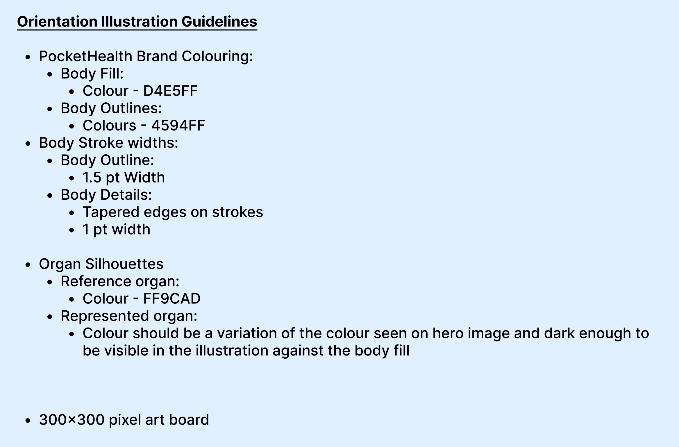
I learned Figma to be able to create the visual system for PocketHealth’s medical visuals. I used PocketHealth’s brand colours for black colouring since they had an established black brand colour.
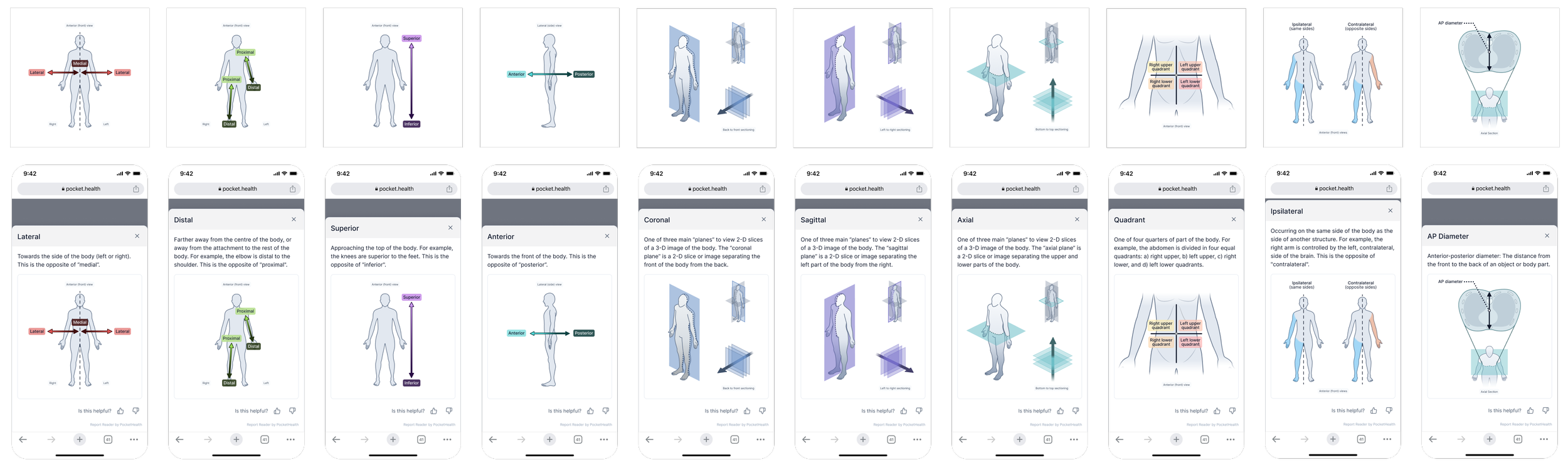
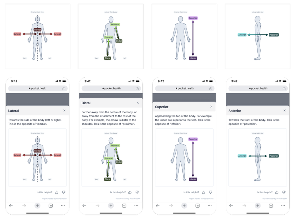
Solving the Orientation Problem
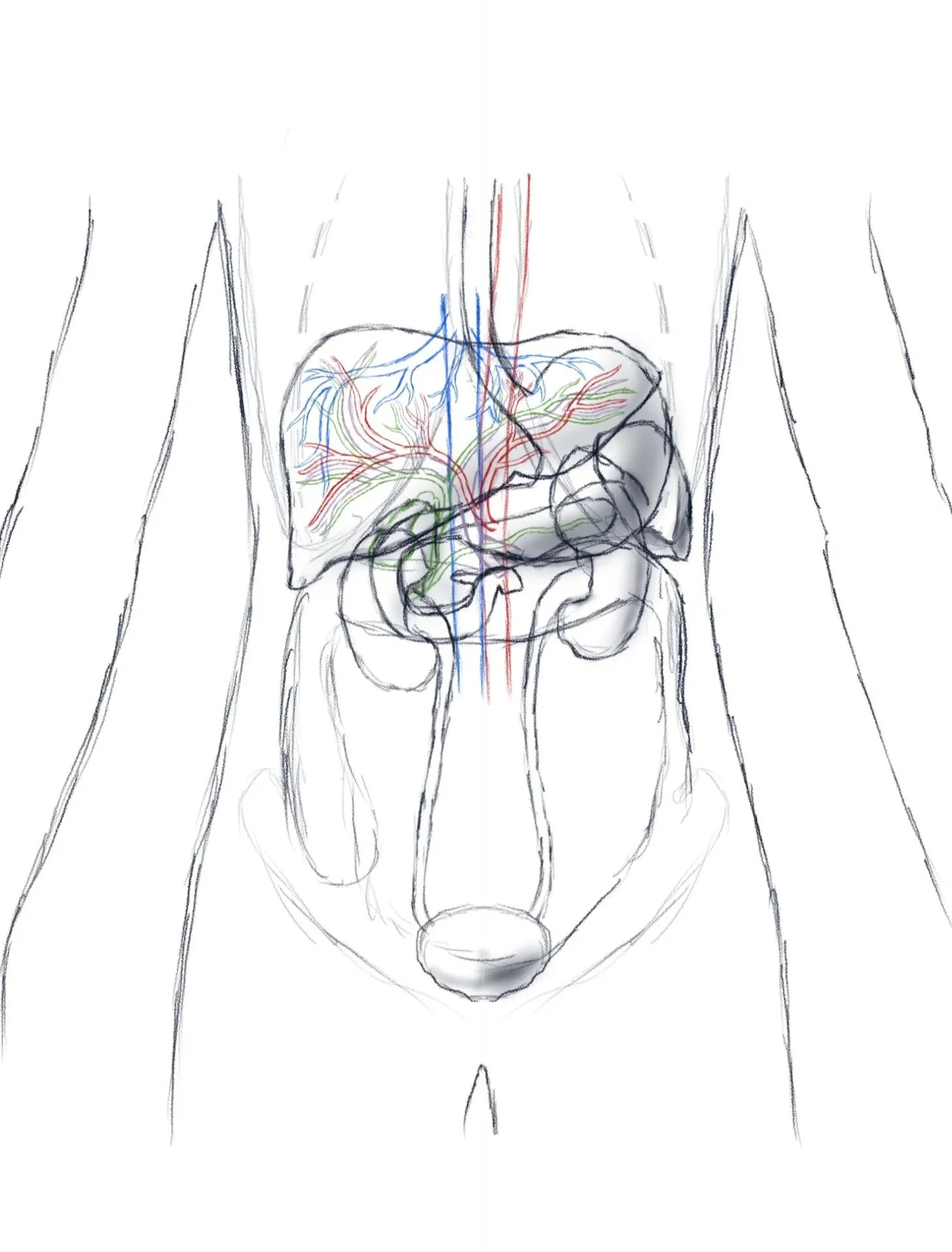
Various sketches for the orientation figure. Procreate.
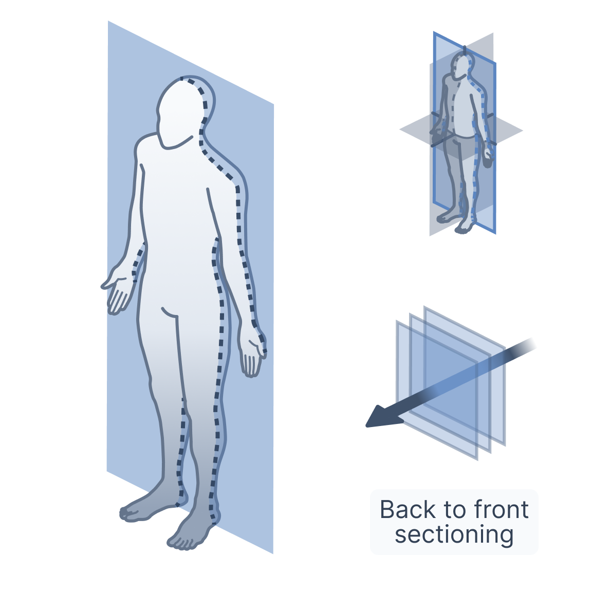
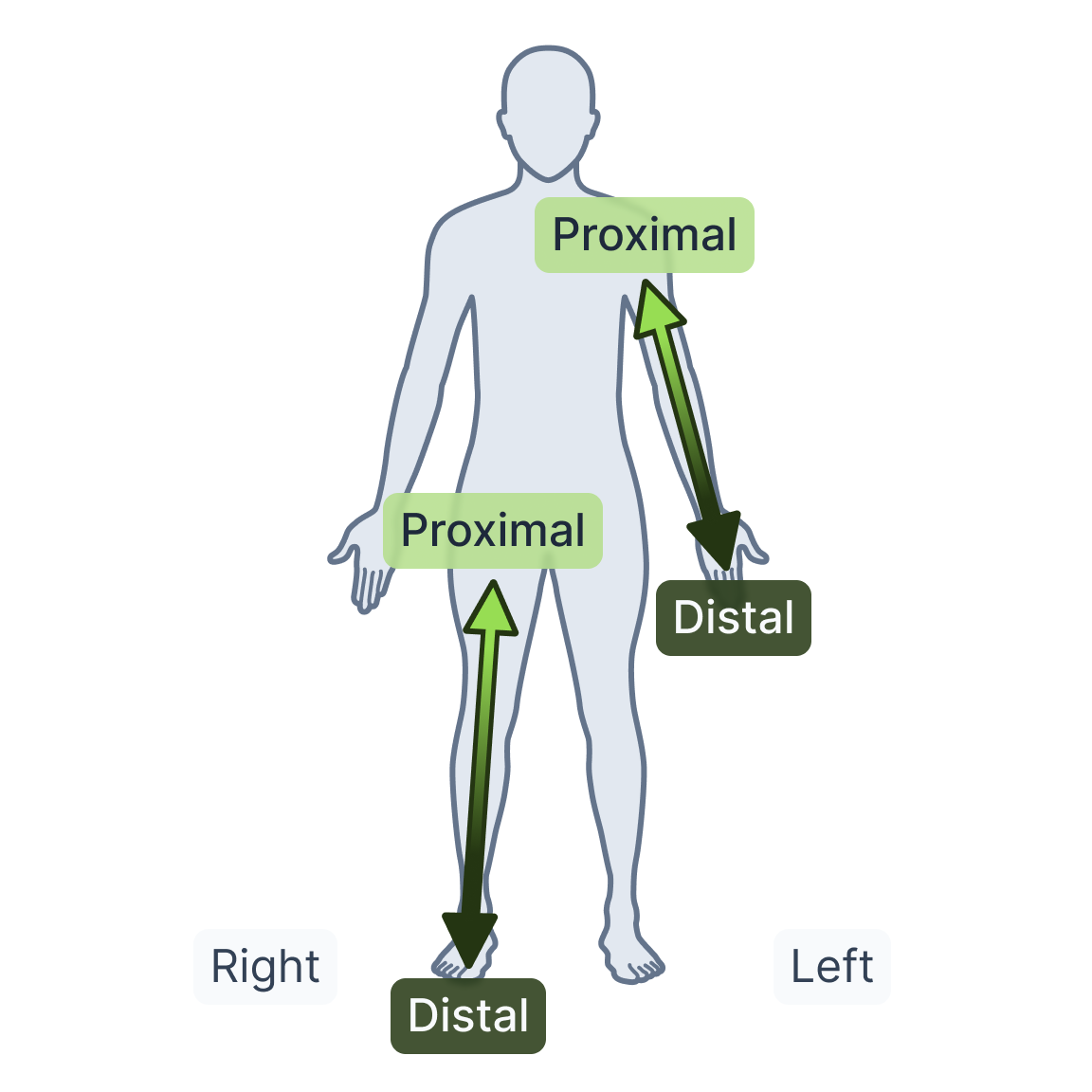
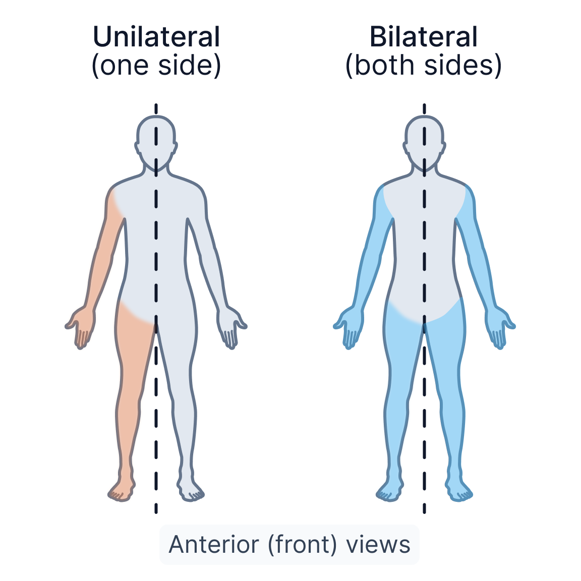
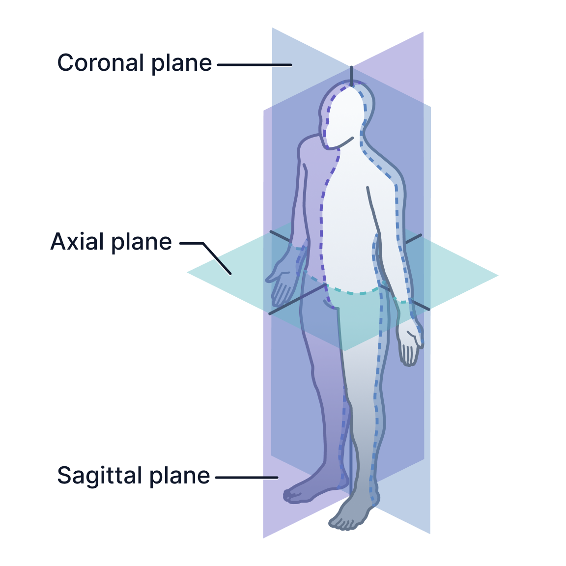
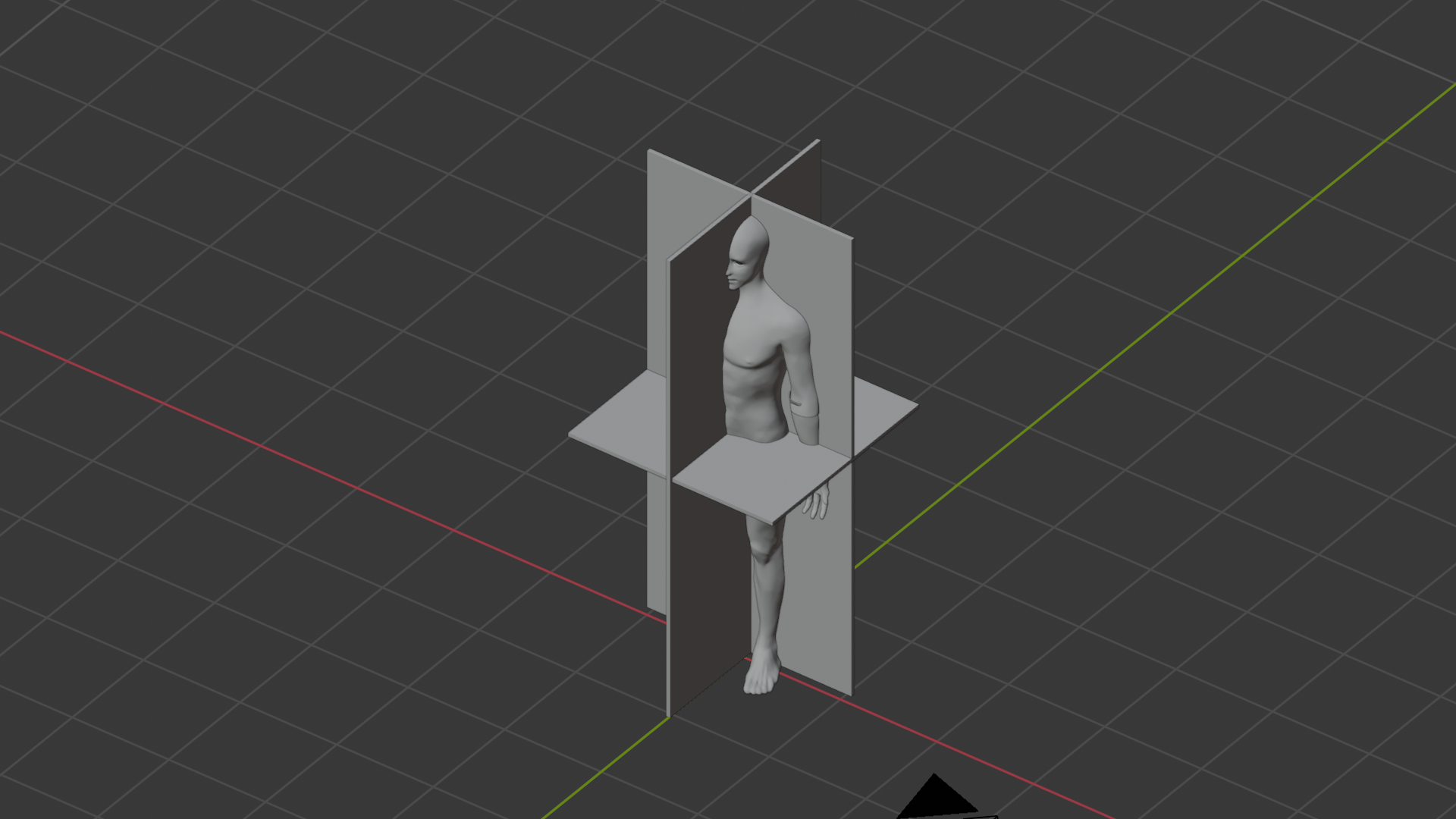
One of the first major tasks involved developing patient-friendly orientation illustrations capable of explaining radiological imaging planes such as sagittal, coronal, and axial sections.
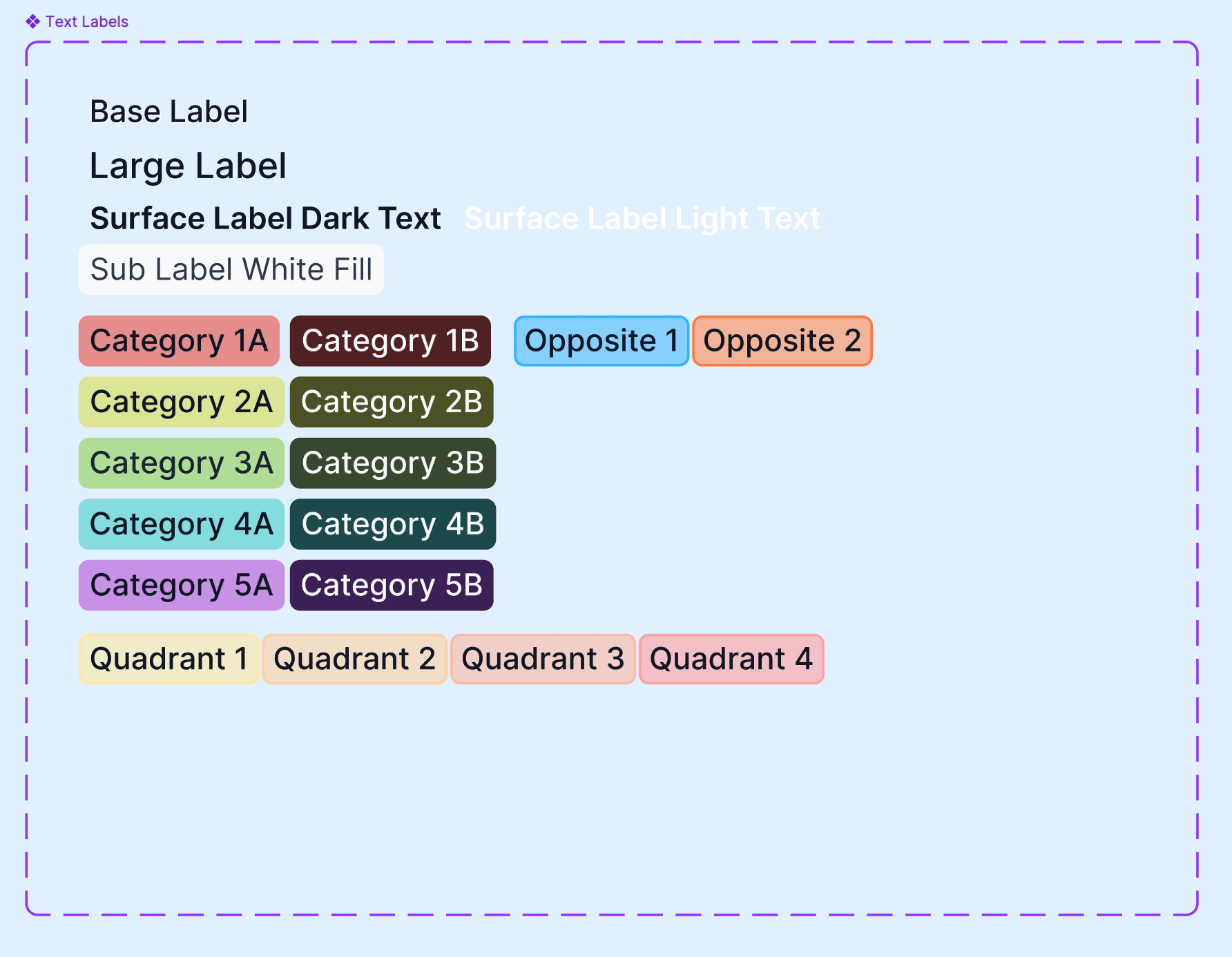
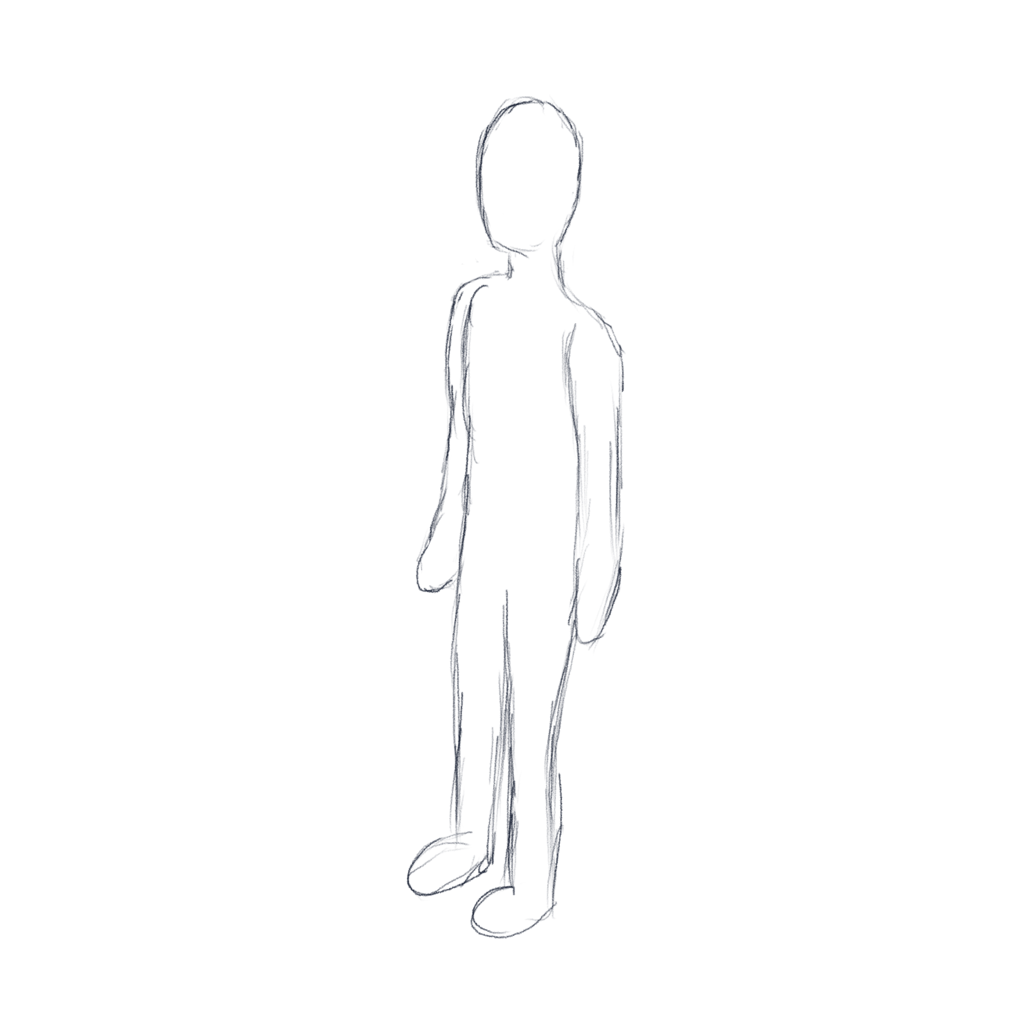
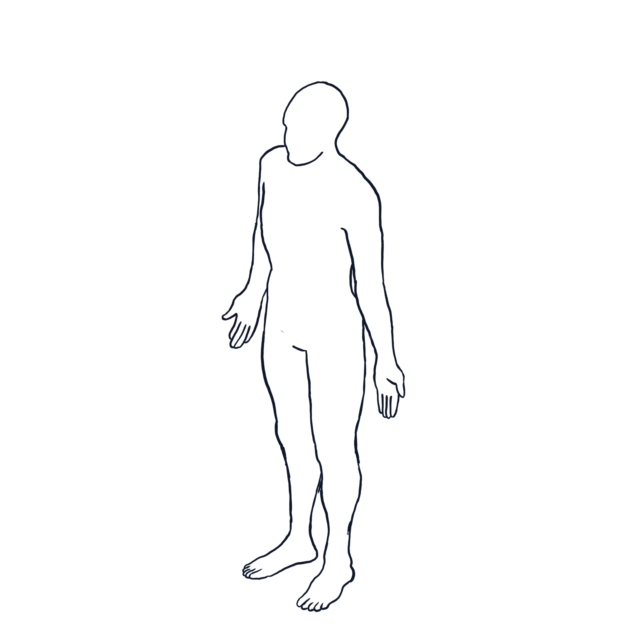
Initial freehand vector sketches proved difficult to scale consistently, particularly when working with complex isometric body perspectives. Because future illustrations would also require accurate anatomical positioning for organs and structures throughout the body, I shifted toward a hybrid 3D-assisted workflow.
Drawing from prior experience in Maya, I independently learned Blender in order to build a reusable anatomical reference pipeline using publicly available anatomical datasets.
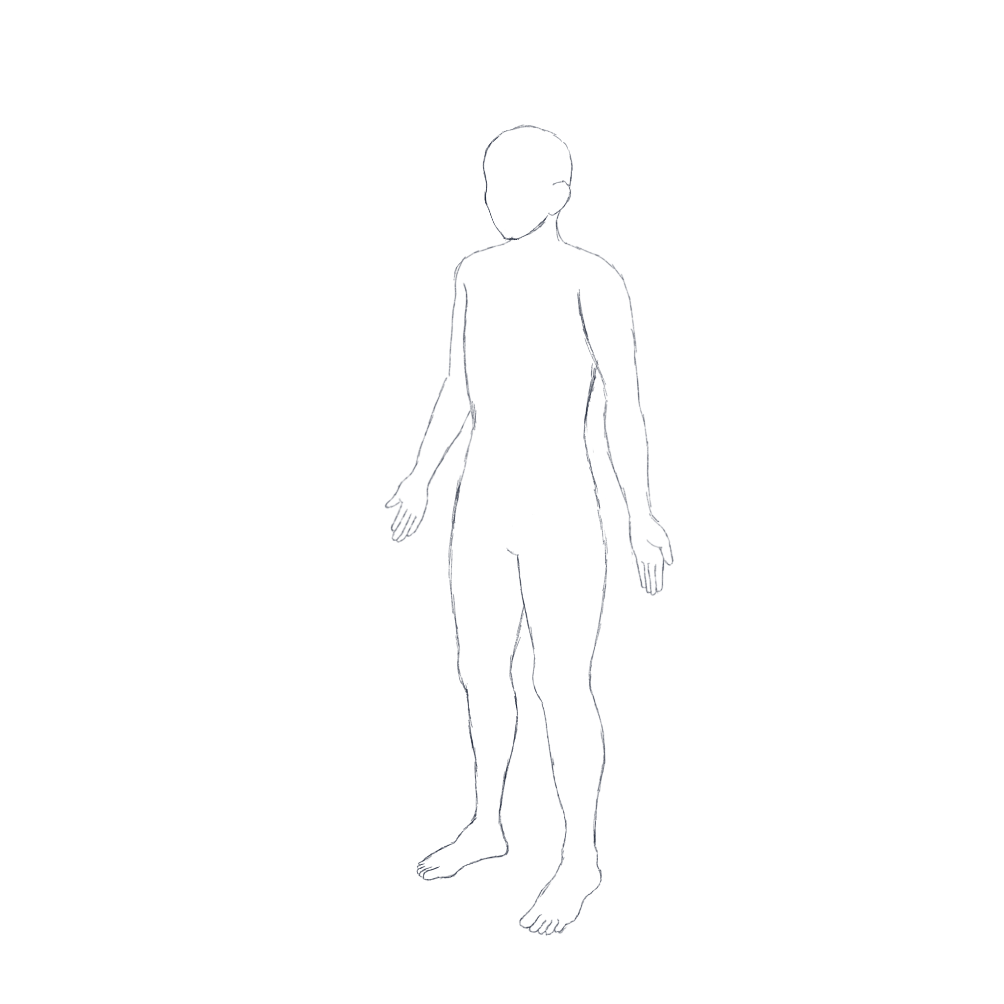
Using these models, I:
positioned the body in isometric perspectives
constructed representative sectional imaging planes
visualized anatomical cuts spatially
generated reusable perspective references
translated the results back into clean vector illustrations
This workflow dramatically improved both consistency and scalability while allowing the illustrations to align more naturally with PocketHealth’s digital product environment.
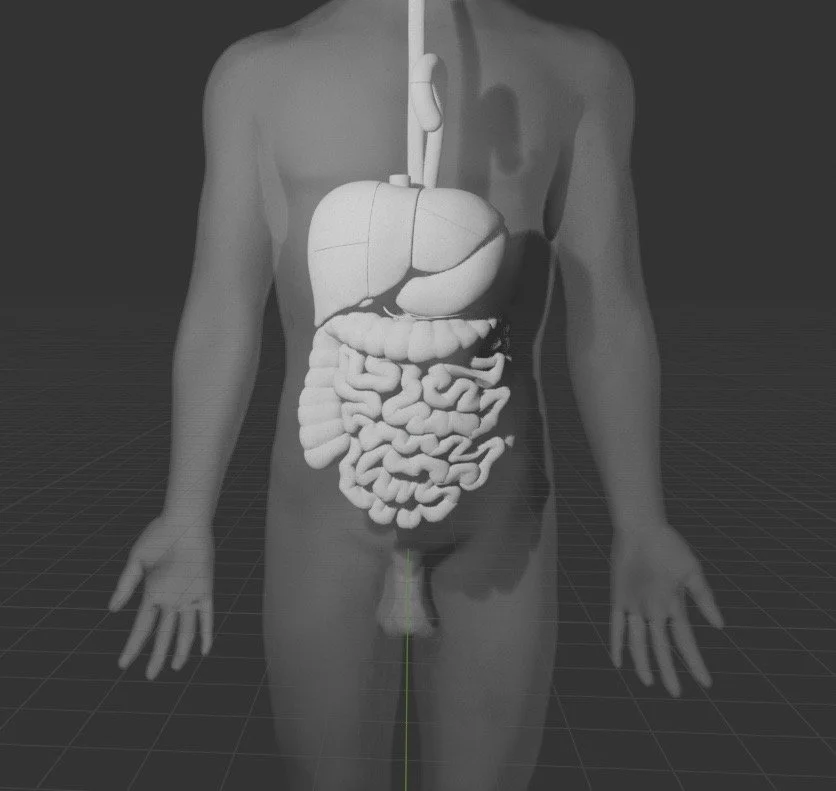
Using 3D datasets was a breakthrough for the workflow, especially since this model included all organs in their relatively accurate positions to each other. Blender. Sketches done in Procreate.
Dataset sourced from: https://lifesciencedb.jp/bp3d/
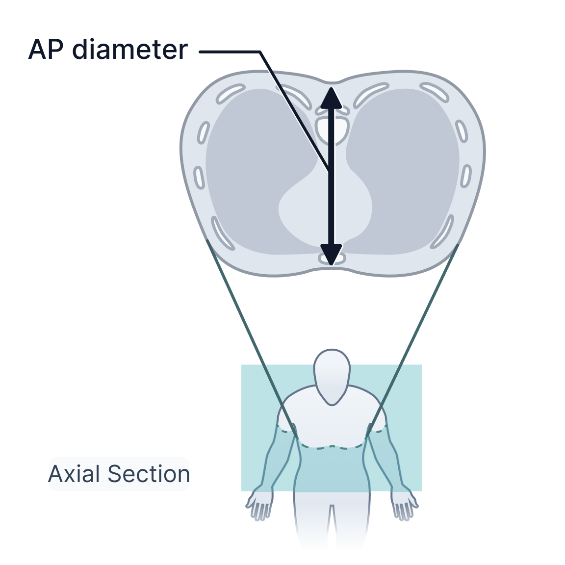
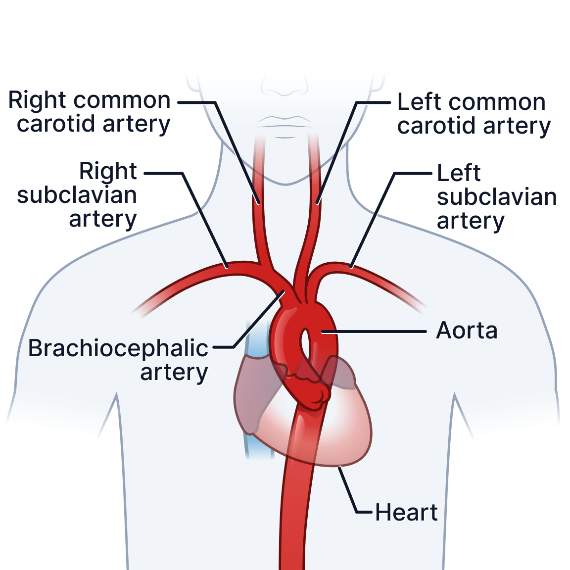
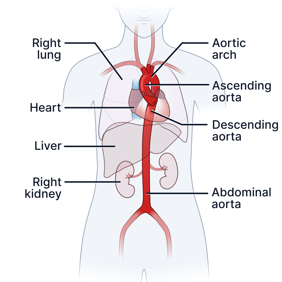
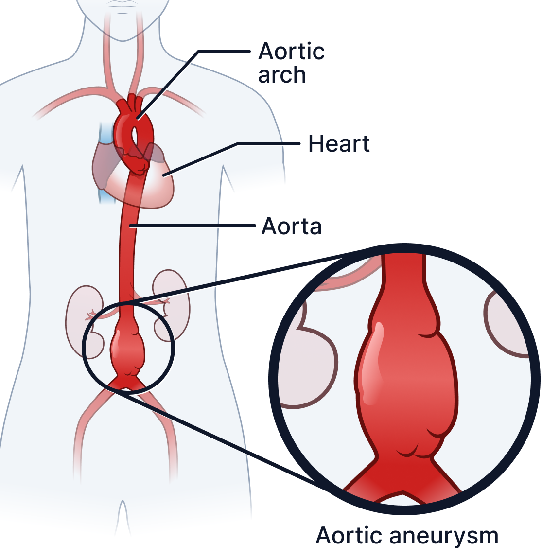
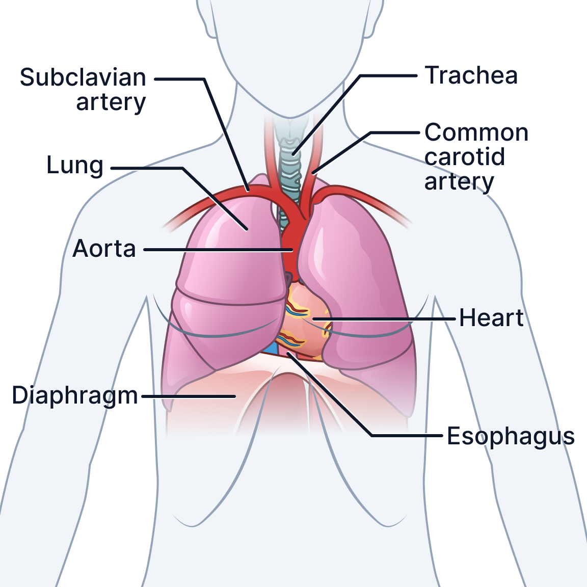
3D models made illustrations such as AP diameter especially accurate and efficient to make.
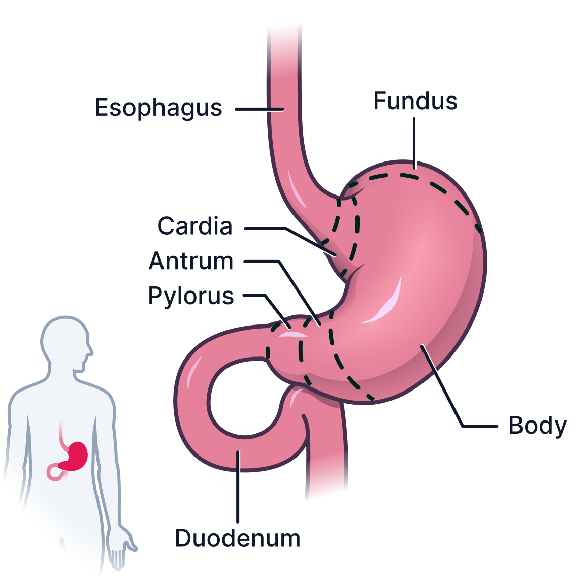
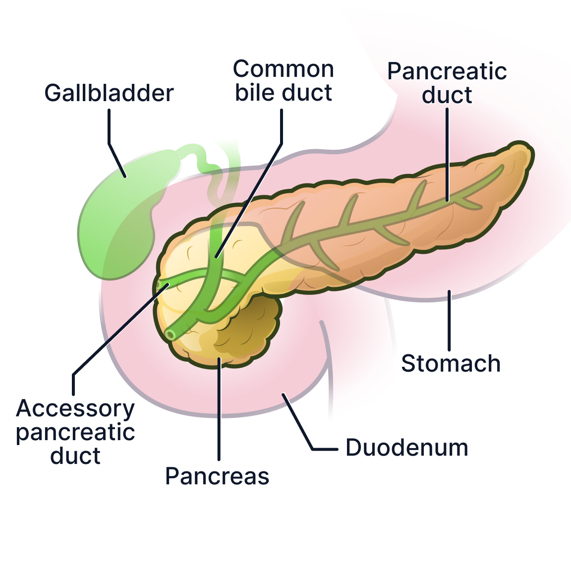
Illustrations sketches in Procreate, vectorized in illustrator, imported to Figma as svgs where they were then labeled using the visual system I developed and exported in 4×4 panels. Illustrations were handed off to engineers for upload in batches.
Product Integration
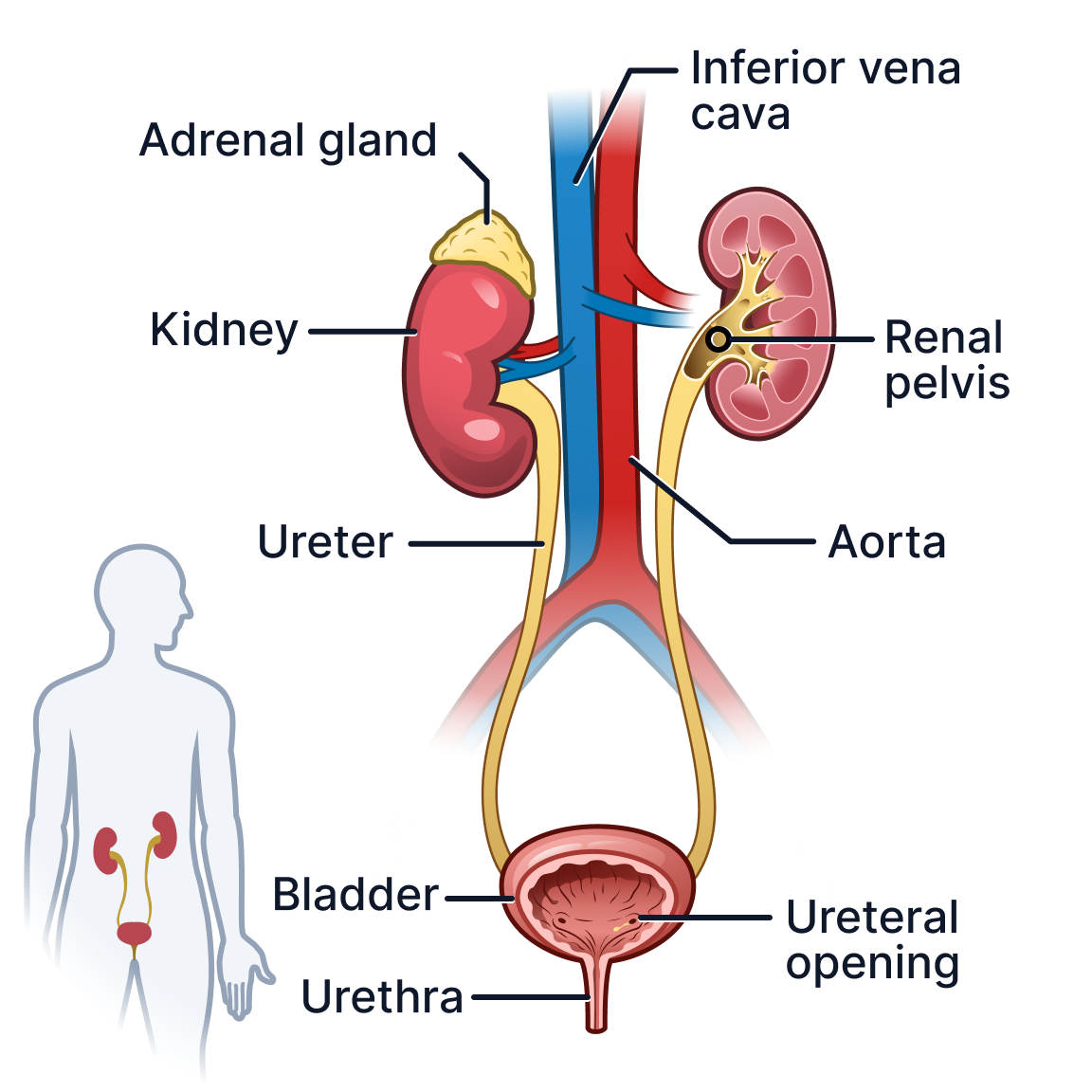
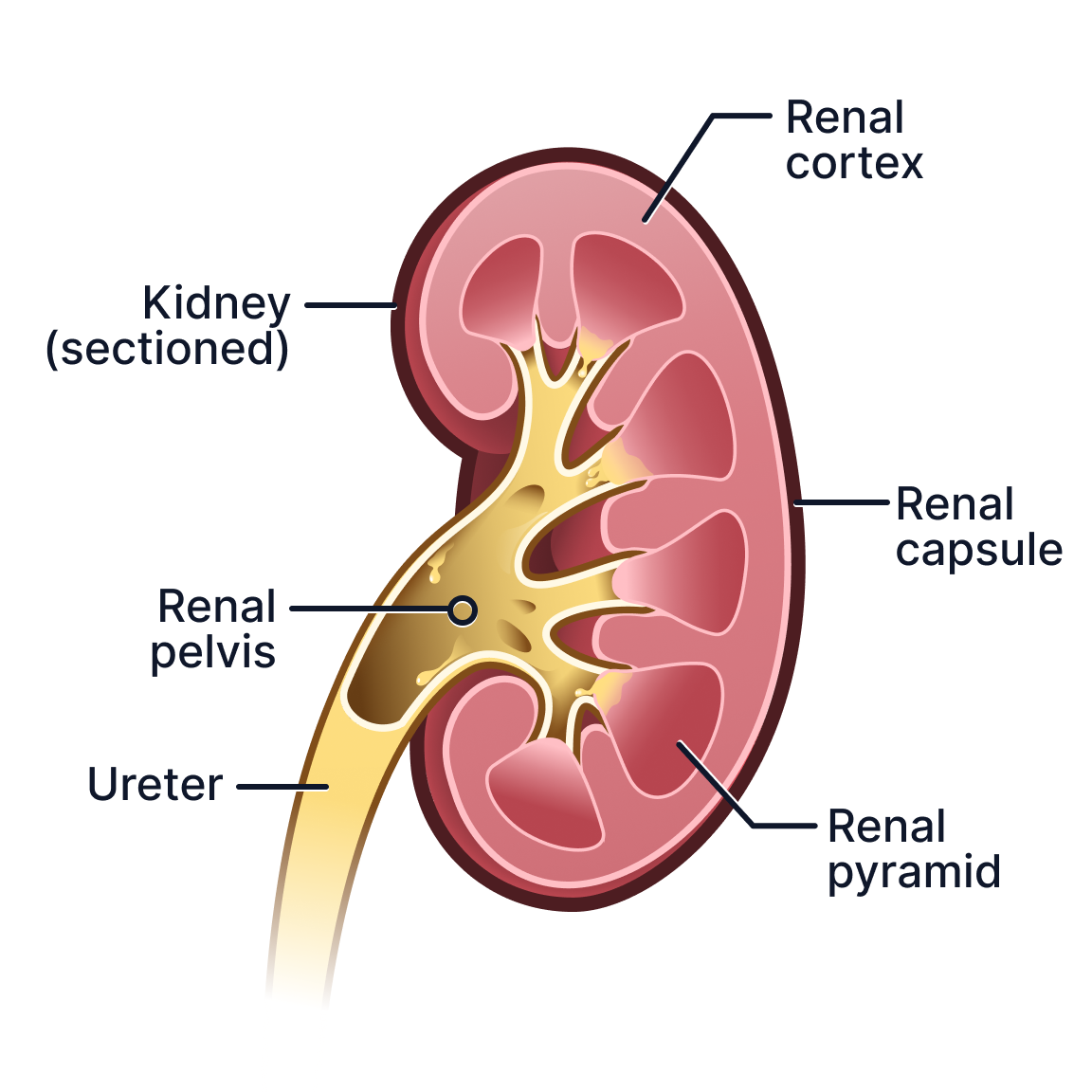
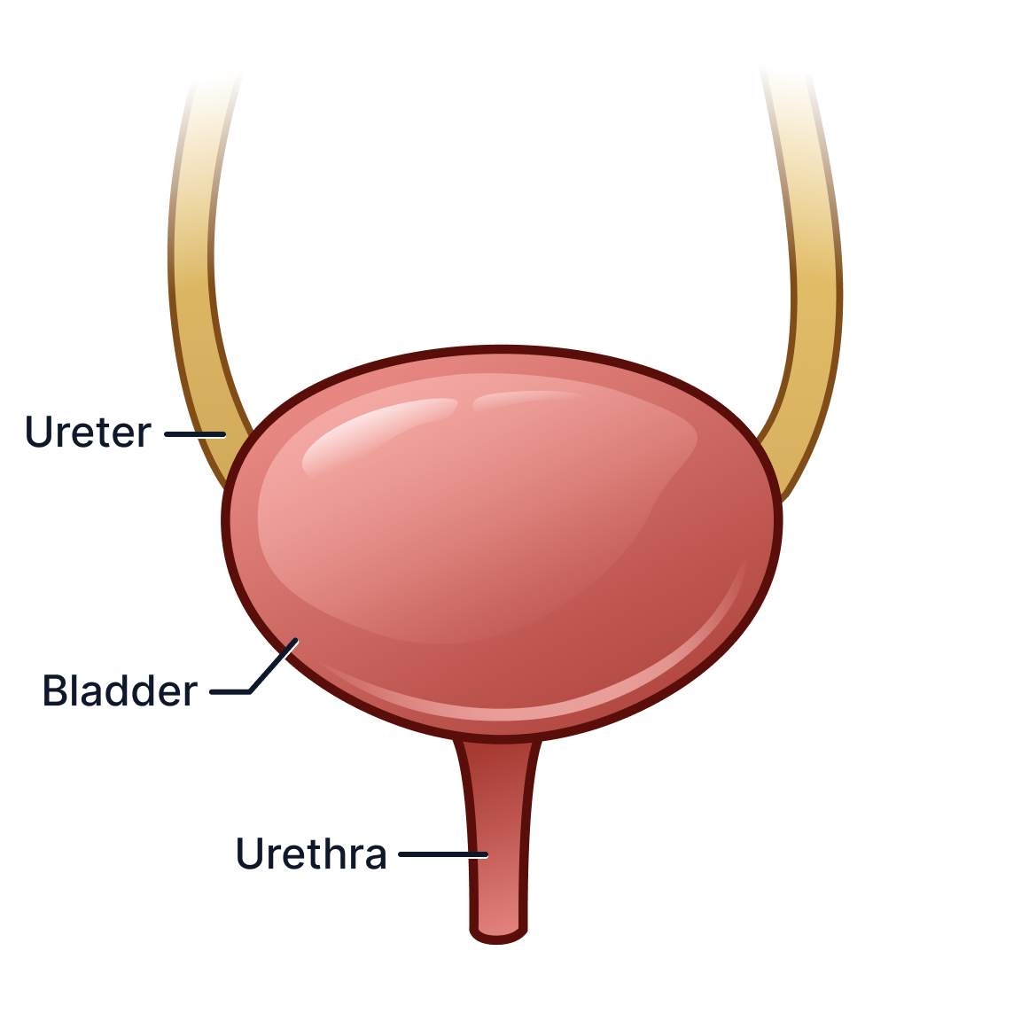
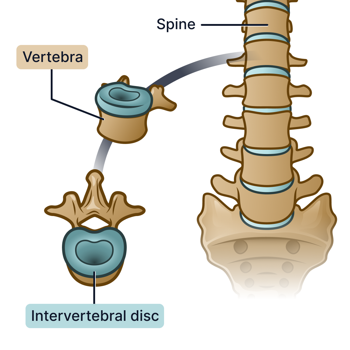
The final illustrations were integrated directly into PocketHealth’s Report Reader platform to support patient education alongside radiology findings.
These visuals helped provide anatomical context for structures, directional terminology, organs, and imaging concepts directly within the patient experience.

All visuals were designed with PocketHealth’s UI in mind, as they were constantly tested and iterated in Figma, using frames matching the existing UI exactly to ensure proper readability and aesthetic appeal within PocketHealth’s MyCare Navigator interface on the phone and on desktop.
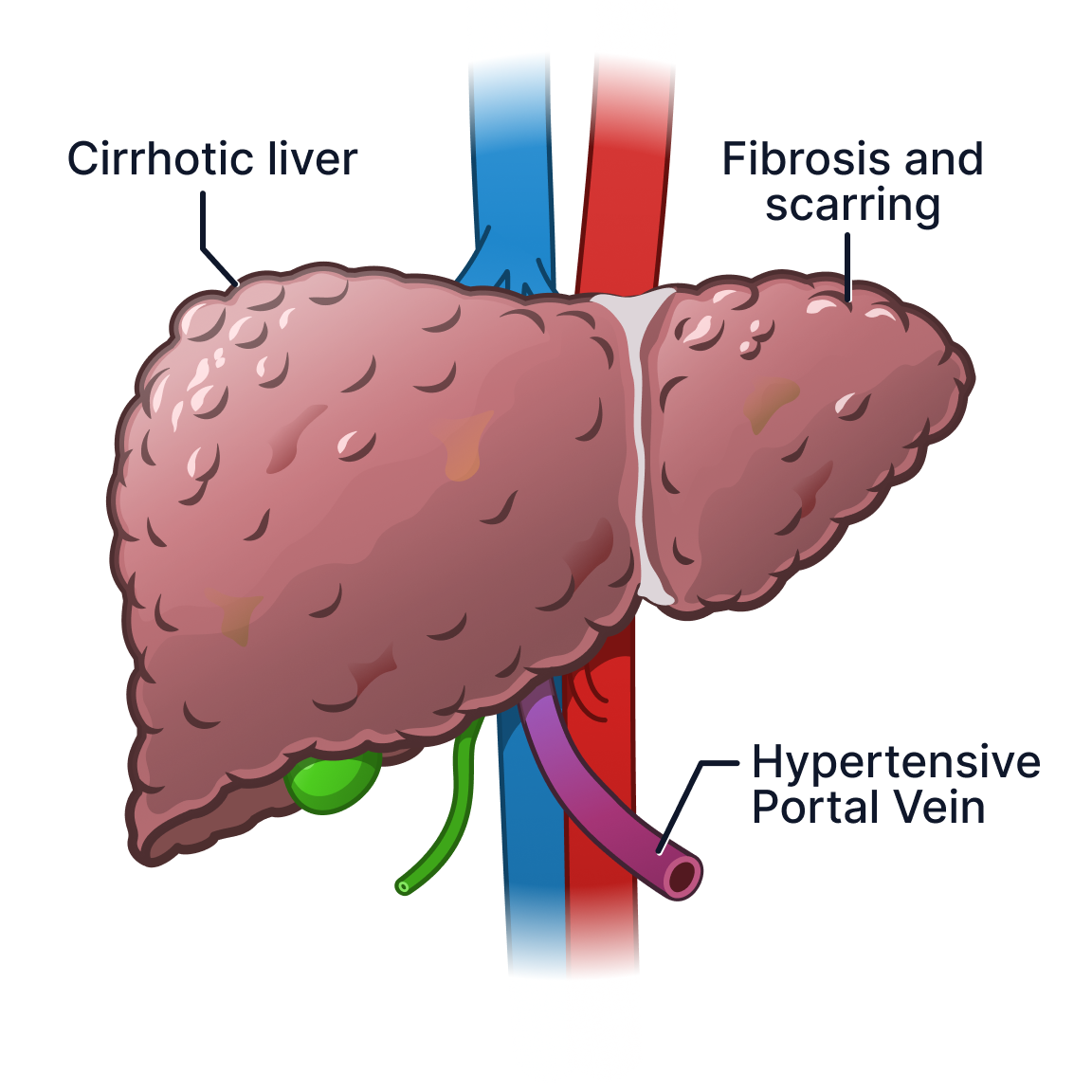
Hover to compare healthy and cirrhotic liver anatomy.
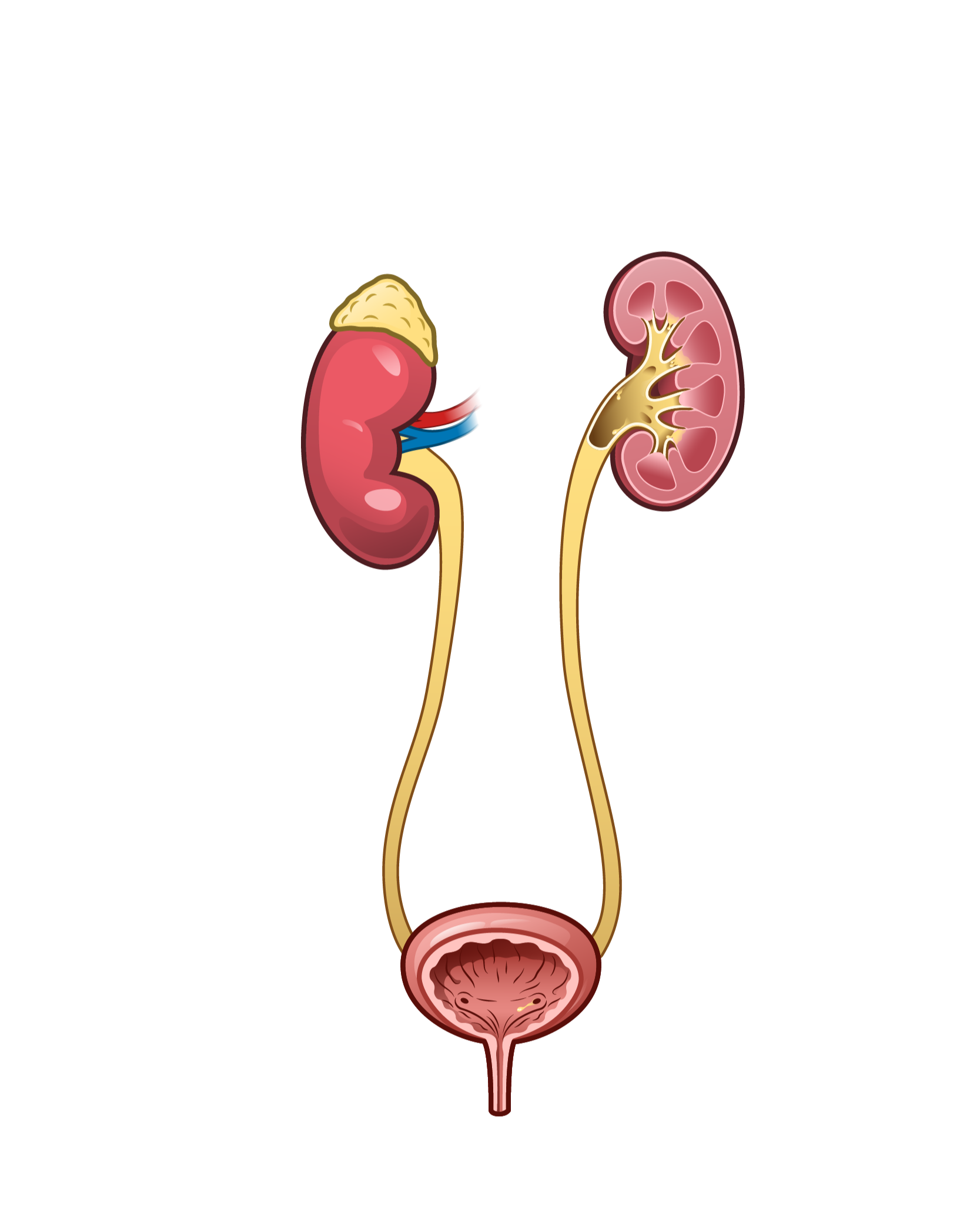
Hover to reveal bladder internal anatomy.
Outcome
“Brendan’s illustrations were quite eye-catching and communicative - helping PocketHealth stand out as more patient-centric and visually engaging. His work consistently resonated with both patients and internal teams, and we were proud to showcase it in demos as a key example of how we translate complex ideas into accessible, meaningful content.”
— Rishi Nayyar, CEO of PocketHealth
The project resulted in the development of a scalable visual communication infrastructure for PocketHealth’s patient education platform. The work established reusable systems and workflows that could support future product expansion, interdisciplinary collaboration, and more accessible healthcare communication experiences.
Exactly 301 reusable assets were made, including use in video advertisements for PocketHealth, in an interactive integrated body atlas, and public-facing visuals during demos at events. This work furthered PocketHealth’s goal in putting patients first by translating complex ideas and what they need the most to better understand their health, ultimately having more autonomy in decisions over their care.
All illustrations were later compiled with the engineers across a three-day project towards creating PocketHealth’s first centralized data visualization. All of the patient’s medical reports and imaging can be viewed using the Interactive Body Atlas, including internal organ systems and various disease states for organs such as cirrhosis for the liver. B. Lazar & PH Engineer Team, February 2025.